Rainbow
UI/UX audit of tour configurator
The Rainbow Company is one of the largest and fastest growing tour operators in Poland, helping to fulfill the holiday dreams of Polish people for almost 27 years.
In August 2017 we did help Rainbow to increase the work efficiency of the tour sellers who use their in-house trip planning system, by conducting an UX / UI audit of the tool.
The task
Our initial task was to develop a business concept and analyze the needs of the customer. At this stage, the most important thing for us was to define the tool's information architecture, understand and describe all key business processes.
Improving the entire UX / UI for better usability of the tool by the Rainbow salespeople was the second stage of our work.
The challenge
The course of works
First of all, we did present the configurator as a certain path that the tour seller working with it has to walk through to find the optimal trip offer. The specificity of the configurator and the very high dependence of its individual components made it a demanding task.
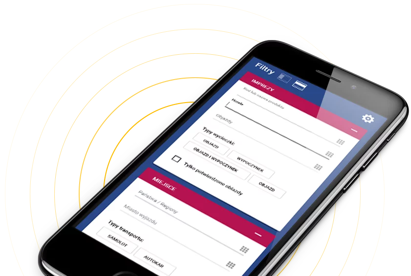
The first element that we separated visually from the rest of the tool were the filters. User can set the display mode (left column or entire page content) of filters according to his or her preferences.
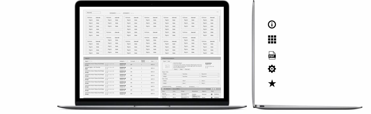
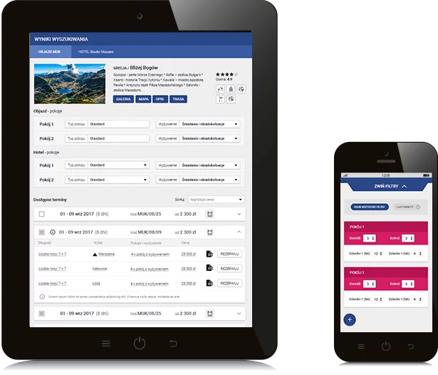
An important assumption of the configurator is that it should work live and in the responsive manner. Subsequent lists in the app are narrowed down live, depending on the user's choice. In addition, we had to keep in mind that the final search results should provide all the information necessary to book the reservation. By pressing the "Book" button the seller is redirected to a separate section of the reservation process, where he must input the customer data. All things related to travel dates, departures, arrivals, available promotions, meals and room standards are already determined at the configurator stage.

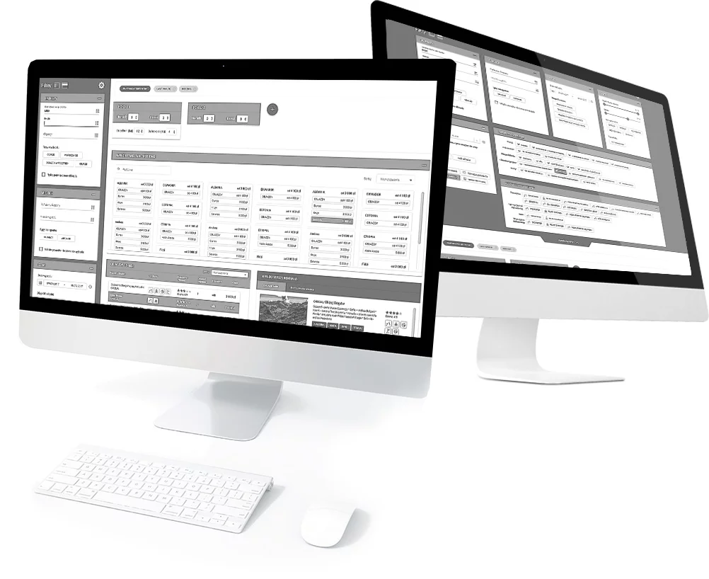
The new graphic design of the trip configurator
Rainbow set a clear goal for us: to make the search options user friendly, so that despite the large number of variables, it would still be intuitive for the sales team. In the process of developing the changes, we focused primarily on creating mockups and diagrams according to which the tool works. The graphic design, based on material design principles, assumed a visual separation of working space, proper colours matching and use of simple, intuitive icons. One of the most important elements we emphasised was the appropriately selected typography, which visually has a great importance for the legibility of the entire tool. The search engine tool is intended primarily for desktop use. The solutions designed by us are easily adaptable to different screen resolutions, as well as to mobile devices (such as tablets).
The design and appearance of our new search engine in cooperation with eEngine has been extremely fast and effective. I particularly appreciate the quality of communication between our teams. Frequent and direct communication combined with flexibility and good understanding of our business needs allowed us to quickly achieve the desired effect.
SŁAWOMIR RAŻNIEWSKI ,
IT Director Rainbow Tours S.A.