Redesign of Smmash.pl - homepage and product page.
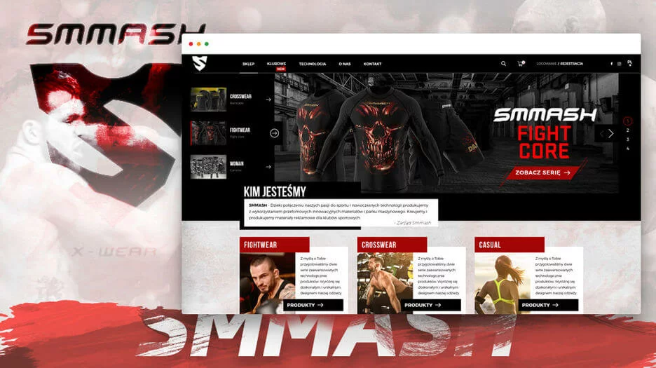
From time to time, we at eEngine wonder what websites closer to our hearts could look like if we had the opportunity to design and implement them ourselves. This is how the redesign proposal for Smmash.pl - one of the popular fightwear clothing brands - was created. Take a look at how it "could" look and let us know what you think about our proposal.
Redesign of the Smmash.pl homepage
In order to better present the content of the Smmash.pl homepage, its width has been expanded to 1430px. This allows for the display of large, beautiful images while maintaining balanced spacing between the elements. The design follows the material/flat design approach, providing a modern look and a wide range of design solutions.
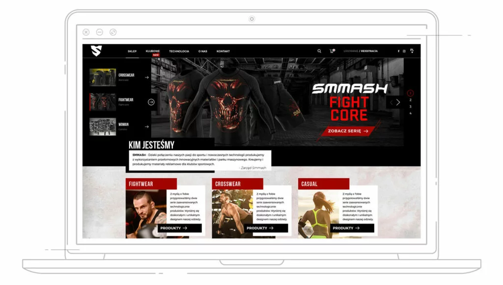
The website design includes responsive solutions to facilitate exploration for users where RWD technology has not been implemented. Due to the sporty character of the brand, the color scheme has been preserved with the use of artistic expressions in the background of the website or newsletter area to enhance the message. More readable fonts have also been utilized.
Header of the online store after a good workout in eEngine
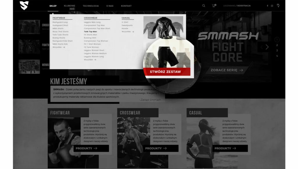
The header of the online store has undergone a major revolution. The menu is more subtle, clear, and takes up only as much space as it should. The mega menu has also been reduced in size and is now used for a more attractive presentation of one of the page modules, which is the "Creating a set" module. This is an additional space where this module is promoted. We have decided to do away with the flags of countries, which have been commonly used to symbolize the appropriate language change. Instead, we have opted for a minimalist solution with the use of a dropdown list indicating the abbreviated name of the country.
The menu spans the entire width of the page and should begin to accompany the user after scrolling one full screen. Menu labels include "NEW" tags to inform users of updates in specific sections.
Slider with a completely new training plan
We thought it would be useful to also focus on the slider and equip it with a few new features to support the product sales process. On the left side, we can navigate through the next models/series that will be displayed on the main graphic, while on the right side, in addition to the automatic carousel, we can navigate through the product/products from the selected series. The final redirection should be ensured by the "CTA button" (encouragement to purchase), placed on the main graphic, which also includes animated elements on hover.
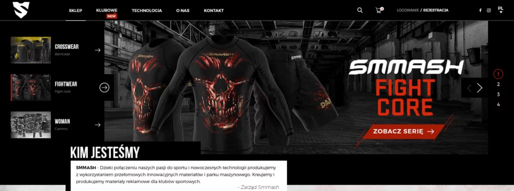
Additionally, we have highlighted the proverbial 2 sentences introducing the brand (Who we are).
The section tiles have been broken down into smaller parts, where everyone can now link to their dedicated subpage. This approach should eliminate the accidental mistake of a store customer getting lost. Large, highlighted photos and clear descriptions should encourage the viewer to click through to the next page they are looking for. In our opinion, both the image and the button should be clickable.
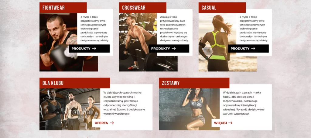
Product section and technologies
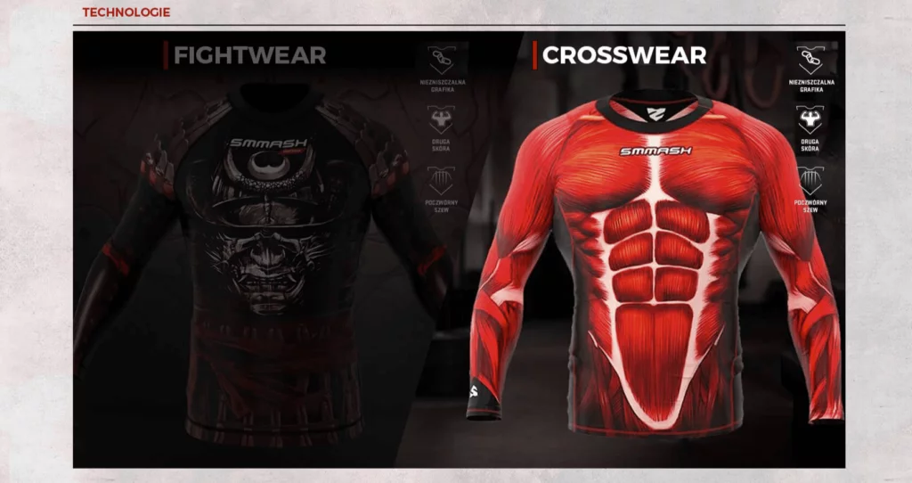
The product section utilizes the newly available space and introduces an additional product. In this version, we have direct access to switch between 3 product categories and 3 views of the next products, which is indicated on the right side. The presentation of products in the new proposal is designed to attract attention and visually present them attractively. When hovering over the images, the cursor automatically changes to the next one in the queue. The initial product card has also been equipped with a short description that serves as a teaser for the actual product, which is located on the product card. The purchase option and price have been properly highlighted.

The "Technologies" section remained on the homepage because it is an interesting element of information presentation. However, this module also underwent a lifting process, consisting of visual and functional adjustments. This section should be displayed and fill the entire width of the content only when hovering the mouse cursor.
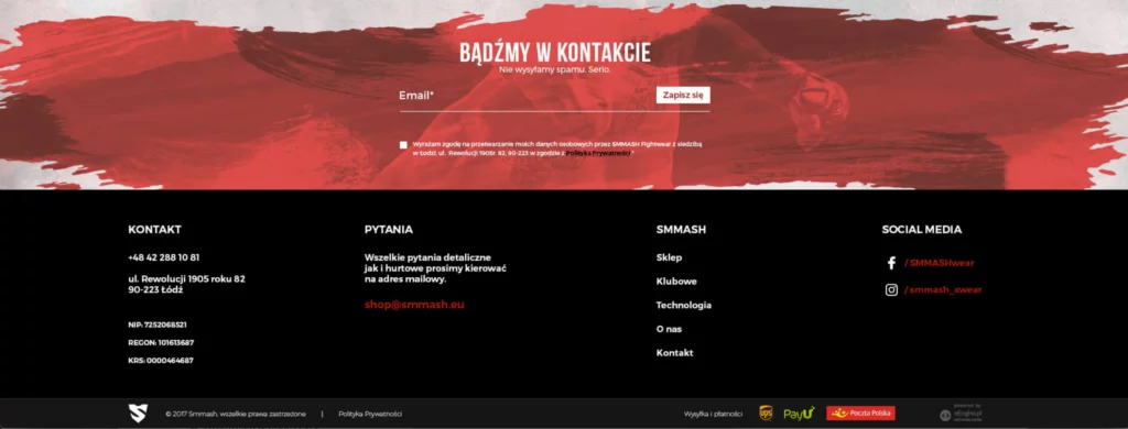
We have decided to give up on having a large number of banners with long descriptions, as they only serve as fillers. Instead, we proposed a newsletter that strengthens the visual message of the website and gives users the option to decide to sign up and receive information.
We designed the footer to be as minimalist as possible, containing only the most necessary elements and informational content.
If you want to see the redesign of the homepage in all its glory, click here. And now, it's time for round two - the redesign of the product card.
The product card of Smmash.pl enters the ring.
The product card puts a significantly greater emphasis on showcasing the product and its value. Placing the product image closer to the center is intended to attract the attention of more customers. On the left side, there is a gallery of images with the currently active one highlighted. On the right side, there is an information section with the option to buy. Reading from top to bottom, we can also specify the parameters and quantity we are interested in buying. We have decided to forgo excessive emphasis on the size table in favor of a less invasive and more commonly used solution: presenting the table in a popup. As an additional feature, we have included the characteristic traits of the brand and the purchasing process, in order to best inform the customer.
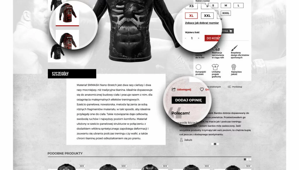
Below is the product description, so that the customer has a full set of information about the item they are purchasing. As a new feature, the recommendation section has been added to the right of the description. Users (logged in) can add their opinions. This approach often strengthens the credibility of the brand and positively affects the desire to purchase.
Above the recommendation section, there are 3 action buttons, respectively: share, add to favorites, and compare. Thanks to these actions, users can share found products, but the store itself can also collect important information (e.g. about the popularity of individual products).
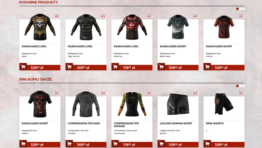
Below, we have the classic construction of recommended products and those that other users have also purchased. It is important to ensure the correct connection of categories.
You can see the full product page design here.
"Virtual" redesign of Smmash.pl
Of course, everything you have seen and read above is just a "virtual" redesign that would require intensive work with the brand and defining the most important goals and values that guide the brand from within in the business reality. Treat our proposal as a thought experiment that we underwent in our free time, between projects.
And if you would like to experience the redesign on your own skin, I hope you know how to contact us.