The new logo project for the Public Library in Aleksandrów Łódzki

One of the more interesting challenges of the first half of 2021 was the creation, by our design department, of a logo for the Public Library in Aleksandrów Łódzki. The collaboration, based on non-profit work, resulted in the creation of nearly 500 files! How did this come about?
The challenge presented to us
The Jan Machulski Public Library, established in 1946 and located in Aleksandrów Łódzki, had not had a cohesive and well-thought-out visual identity to match the requirements of its current activities. Although the institution of the library is mainly associated with book lending, it turns out that both the Aleksandrów Łódzki library and many others like it in the country are also engaged in a wide range of cultural activities. This encompasses a REALLY broad spectrum - from the aforementioned role as a book-related institution to the organization of concerts, events, cinema, and tourist information.
We were tasked with the difficult challenge of combining all of these functions. A logo is a symbol that identifies a particular brand and defines its activities. It must be interesting, but also relatively simple, so that its use in the future does not cause problems (e.g. in printed elements) and is easily memorable. On the one hand, we want to attract attention with the logo, but on the other hand, we want to be well understood in terms of what we do. It is worth mentioning that the logo consists of a symbol (graphic sign) and a logotype (usually the name of the company, activity, additional slogans).

Designing the logo - project assumptions
The main assumptions of the newly created logo were:
- Reflect the wide range of activities of the library
- Create a timeless design that can be used in various applications
- Refresh the image to build a consistent visual identity
- "Not to lose sight of the roots", meaning the logo should refer to the original character of the library.
Do you know those memes "designer nightmare - it should be modern with a touch of tradition, colorful but not too flashy"? Maybe in our case it wasn't that bad, but we knew it wouldn't be easy either. The people responsible on the Library's side, with whom we had the opportunity to cooperate, were a huge inspiration and help for us. We haven't met such open and passionate people in a long time. It was an additional challenge to deliver them a logo that they would be proud of and would use happily in their daily communication.

The process of creating a logo
Keeping all of the above points in mind, we attempted to create a logo... and we failed :
In the initial stages, we couldn't come up with any symbol that would meet the established criteria and make us feel like "yes, that's it!" Although the total time needed to develop the final concept wasn't too daunting, we still haven't created a logo for our library. In fact, we should say - not just one logo.
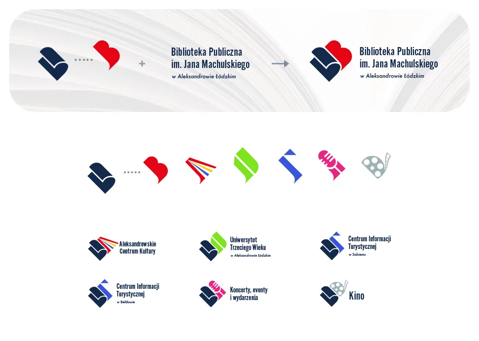
Taking on the current status of the library, we also tried to approach the topic more broadly. Thinking out of the box allowed us to ask ourselves, "do we need a logo, or a cohesive identity?" As a result, we created not just one, but several symbols depending on the type of activity.
What did it look like in practice?
We started with what everyone associates with a library - books, OPEN books, just like our library is open to new challenges One side of the book refers to a specific type of activity. Additionally, each activity has its own dedicated color. By maintaining the same typography and base color for all variants, we were able to create a cohesive identity while maintaining originality.
Furthermore, if the library's activities expand beyond its current functions, we can easily create a dedicated symbol for it.

Summary of cooperation
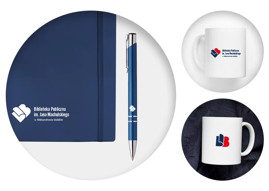
Nearly 500 files... where did this number come from? We always try to deliver our projects in versions that will meet the client's needs - both for print (vector files) and web (raster files). Each logo for the Library (per activity) was delivered in several versions:
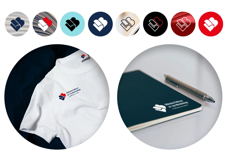
- color logo (on white and dark backgrounds)
- monochromatic logo (black, white)
- emblem (also in several color variants)
- linear version (emblem not filled with color, drawn with lines) - upon special request of the client.

If we multiply the number of variations by the number of logos we designed, we get a number close to 500! Of course, all the packages and files were carefully labeled with information on which ones to use and where.
We are proud that despite the difficult task, we managed to meet the client's expectations. The library in Aleksandrów Łódzki is not just about books, but also events, concerts, cinema, and other cultural activities. We are glad that we could take part in this exciting project and contribute to promoting culture in our region.