What to pay attention to when designing an informational website

It's 6:30 in the morning. Monday! Before you reach for your morning coffee and breakfast, you'll first reach for your smartphone or just turn on your computer. In reality, you'll start this day like any other, by browsing the news or technological novelties on your favorite informational website. It's your daily ritual. But wait! Something's not right... You pause for a moment and realize that you're looking at a completely different informational website. It was your favorite portal and suddenly it looks completely different! Change has come and... it's not so bad. It's going to be a good Monday.
The informational website you've known for years just got a new layout. Surely many users are in a similar shock as you. Let's think about what actually happened (and why?).
In this situation, one fundamental question arises: how to efficiently carry out a redesign of an informational website? For better context, imagine that we will be working on a portal that generates 5 million views per month. Our task is to design the new layout in such a way as not to discourage (too many) users, and actually generate even more visits. Let's begin.
Why is change necessary?
When it comes to redesigning an informational website, it's important to examine what we're really dealing with. In this case, data provided by the client will be essential.
It turns out that even on a website with a million monthly sessions, a change in the design and information architecture is often necessary. This can be due to faulty or incomprehensible functionality of one of the components or simply an outdated design that no longer meets current standards.
Changes are usually motivated by the desire to increase traffic. There are limits that websites are unable to exceed for various reasons. To identify these limits, usability analysis is needed to uncover the root of the problem.
From a web design perspective, every project presents a challenge. This is especially true when there are specific guidelines to follow, leaving little room for artistic or functional freedom. After undergoing a revolution, such a website must maintain its generated traffic, and above all, acquire new visitors.
What motivates a client to change the appearance of an informational website?
In the vast majority of cases, although there are exceptions, the client doesn't understand that creating a good IT product requires time and a process.
Such an approach allows for eliminating errors and optimizing the product even during the design phase. The most common reasons that motivate website owners to make changes are related to the desire to refresh the appearance. The project is no longer appealing and has become outdated.
And that's good! It's worth keeping up with current trends and being aware that change can bring new value. This is a good starting point. Analyzing the competition also allows for looking at one's own website from a different perspective than before.
The content that is frequently added to and varies in length is a very important element of any informational website. Its purpose starts to fail. What should interest users the most is being overlooked. The client wants to reverse this situation and present new entries in an easy and engaging way for readers. Interaction with website users is one of the most important pillars of such a project.
Visitors to the website want to share their observations through discussion (comments). It is natural to provide the possibility of commenting, adding links, images, or other attachments to the discussion.
The biggest problem, which may seem outdated by today's standards, is still the issue of website responsiveness. It happens that even large websites are not designed using RWD techniques. Therefore, it is necessary to ensure that the project is adapted for mobile devices, especially in terms of Google's SEO requirements and the convenience of users visiting the website from smartphones or tablets. Another aspect that should motivate the creation of a project within the RWD technique should be information from Google Analytics, indicating what percentage of users visit the website from mobile devices.
It is known that an informational website cannot sustain itself solely through traffic, so we must include advertising. We present the client with possibilities and good practices from the point of view of visual consistency regarding the type and placement of advertisements.
Native advertising fits perfectly within the design framework, complementing the website not only with essential content from the client's point of view but also providing very pleasant aesthetic experiences. Native advertising is also a kind of response to the steadily growing number of users using AdBlock (especially in Poland, this trend is gaining strength). People like to look at images, so a proper balance with a focus on presenting content using attractive graphics works well.
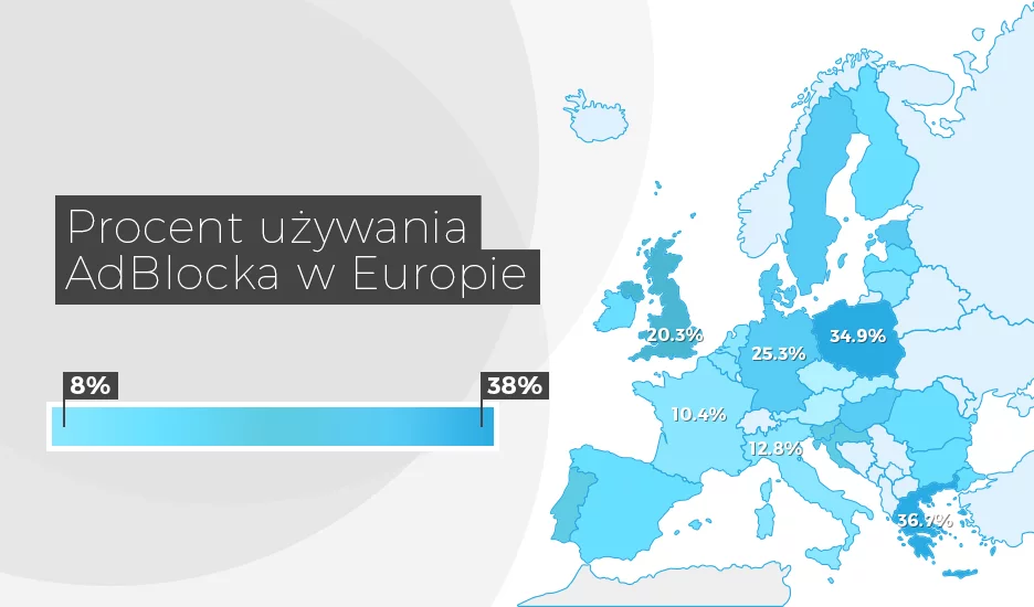
The errors that websites are burdened with are the result of the legacy of old design practices. Menus that, in fact, often consist of three visible levels, where only one or two tabs were most heavily exploited, have no reason to exist. The height and location of something in the form of a box with several articles effectively lowers the proper content of the page. Many websites have a right column with non-engaging user sections. Such places also need to be redeveloped.
The result of the above-mentioned errors determines the transparency and attractiveness of the project, which is to encourage users to browse content again.
After such a situation is presented, we can proceed to the proper work.
Before you start designing an informational website, conduct an analysis.
Are you still with me? Great. I hope you're getting something interesting out of this. We're getting into the specifics now, so fasten your seat belts.
The work on a new informational website should begin with preparing an appropriate brief. This document forms the basis of what the client wants to convey to us. Thanks to it, we can deduce what is expected of us and what direction of development is desired. Another value of such a document (which is not obvious to everyone) is that the brief essentially serves as the basis for dispelling later doubts and preparing everything according to the client's guidelines.
In the next step, it is essential to familiarize yourself with competing websites. There is nothing wrong with drawing inspiration from others. It allows you to see what practices they use, and you may find something that works better for your project. Moreover, it is natural to get a deeper understanding of the business area for which we are designing. After all, every field has its specificity, beyond which we should not go to avoid being mistakenly associated with something.
I mentioned native ads earlier. This is not only an aesthetic solution for the website but also a kind of challenge. Every designer must anticipate situations where ads are not active - the informational website still has to "look" without them. There is a way to avoid the undesirable effect of leaving holes caused by ads when, for example, AdBlock is active. The principle of filling in the places where the mechanism has blocked the ad is mainly styles that allow the blocks to flow on the page relative to the window's width. The main problem we may encounter is detecting that AdBlock has blocked the ad display. The solution is straightforward because we know the names of the containers where we placed them. With simple JavaScript code, we check whether a particular container has the correct height and remove it from the page, which allows the blocks to flow and maintain the website's consistent appearance. Therefore, when deciding to cooperate with a company that would design a new informational website, it is worth questioning them adequately to be sure that they will prepare your portal for every eventuality.
Equally important elements of the analysis are materials sent by the client. Such data can provide a clear picture of the website and its biggest problems. I mean here all kinds of heatmaps from specific periods and records of user journeys. Knowing where most readers drop off, we can make appropriate adjustments in the new project, which will make, for example, fewer users get lost.
What should the UX process look like?
The most exciting stage of creating a new information service is the UX process. It is through this process that we discover that our initial assumptions, to which we were convinced, do not always pass the test in the conditions in which they were implemented. Users and their behaviors will largely decide the effectiveness of the designed solutions. Where to start?
At this point, the most appropriate starting point is, of course, the brief. However, it has already been discussed, so let us move on.
The next stage is to understand user behavior. By this, I mean analyzing problems and discovering their needs. At this point, it is essential to carefully confront these two elements with the business goals that the client has set for themselves. If budgets allow, it is worth conducting interviews with focus groups, which will further help to understand the needs and behaviors of the audience of the information service. We then have another material with a data set that needs to be processed later. At this point, we get a picture of the problems that end users must face, which allows us to know their main preferences when browsing our portal.
Creating a persona is an extremely important stage. It should be one of the first steps we take throughout the process. It should not be idealized but as close to reality as possible.
What characterizes a good persona?
- Helps to understand the user
- Presents their goals, needs, and concerns
- Describes the project goals from the user's perspective
- Is a result of the patterns observed during research
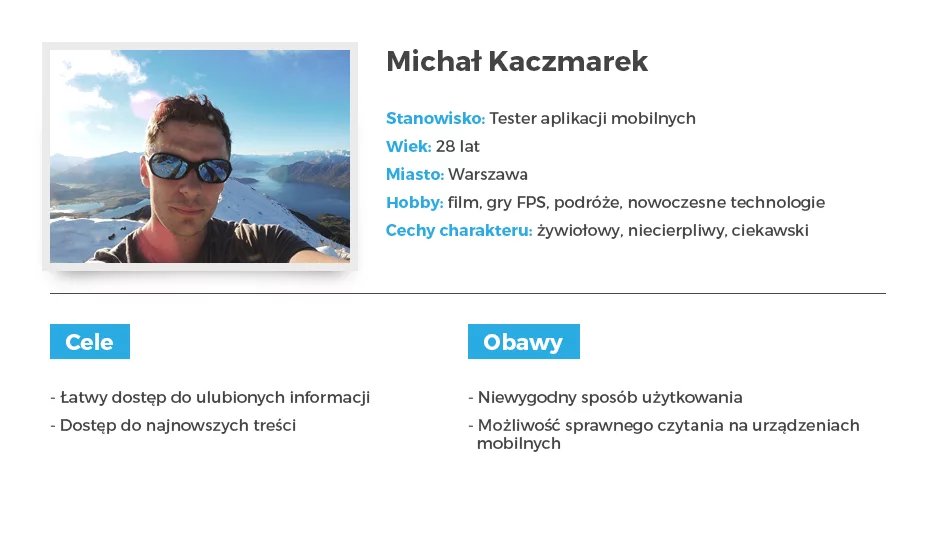
By creating a persona, we can almost unequivocally know who we are creating the product for, in this case, an information service. It is worth taking some time to create a persona card since it will accompany us throughout the project. Let's make sure to include an aesthetic and natural-looking photo that reflects the user's age and character. And of course, the most desirable elements: demographic data, income information, what they pay attention to, what they value, a few words about their personality, favorite brands, and what they don't like. There are no real limitations when it comes to this. Similarly, there is no limit to the number of personas we can create. However, when creating more than one, we may sometimes see data degradation, so we need to estimate which functionalities will be more important from the user's perspective. The persona should act as a filter for actions accompanying product creation.
The next stage should bring numerous conclusions generated based on previously gathered data. It's time to create the first prototype.
We are designing the first prototype of a new version of an informational service.
It is worth starting with the architecture design, various use cases, or even just the flow paths. Both graphic programs and sketching on paper can be used to carry out these tasks. I have used both techniques and cannot determine which variant is better, as they should ultimately yield the same results. Creating a paper project can save more time and provide direct control during all tests. Therefore, if time is not your ally in carrying out a project, choose a reliable pencil. On the other hand, if you want to create more complex models with animations and graphics elements, the best way is to use one of the many available software options (such as Axure, Sketch, UXPin, and many others).
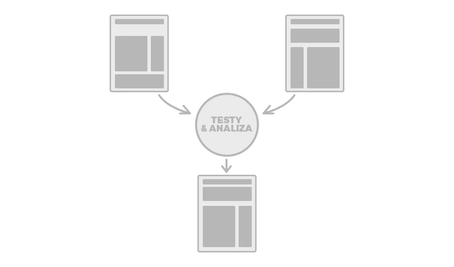
Thanks to well-prepared prototype views, the project will be more understandable, and the mockups themselves can serve as a form of project documentation. Tests with users can and should be conducted on such prepared models. There are many usability tests, such as A/B tests, hallway tests, contextual interviews, and eye-tracking. It is worth using one of them to check if the tested use case confirms our assumptions. The conclusions obtained are very valuable and should add value to the project. This way, we will be able to conduct an evaluation to improve our prototype.
At least two versions of the tested element or even the entire project are necessary for A/B tests. During the study, functionalities and procedures that look good or have passed usability tests are identified. Such an undertaking saves time on later, possible modifications that may not be as measurable as those defined early enough.
After accepting the mockups, we move on to the graphic design stage. In light of the discussed topic, it is now much easier to start designing than starting from scratch. Going through the next stages of the process of building an informational service, a set of functionalities and procedures that are worth including in the graphic design project is identified. Such data support is often invaluable and should be a support for both developers and other team members working on the project. This makes it easier to implement functionalities and understand the ideas of individual solutions. The design process also involves the application of consistent design to the interaction and service elements, tailored to the interests of users. Design consistency should be kept in mind, but more importantly, the readability of the content, especially for this type of service. The attractiveness and effectiveness of their presentation are largely determined by the field they address.
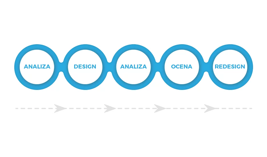
It should be remembered that every project has its own cycle. The product evolves and should be regularly improved. For this purpose, sometimes certain views have to be redesigned or further designed to meet the needs of the most demanding users. It may be a marathon of trial and error, but success awaits us at the finish line.
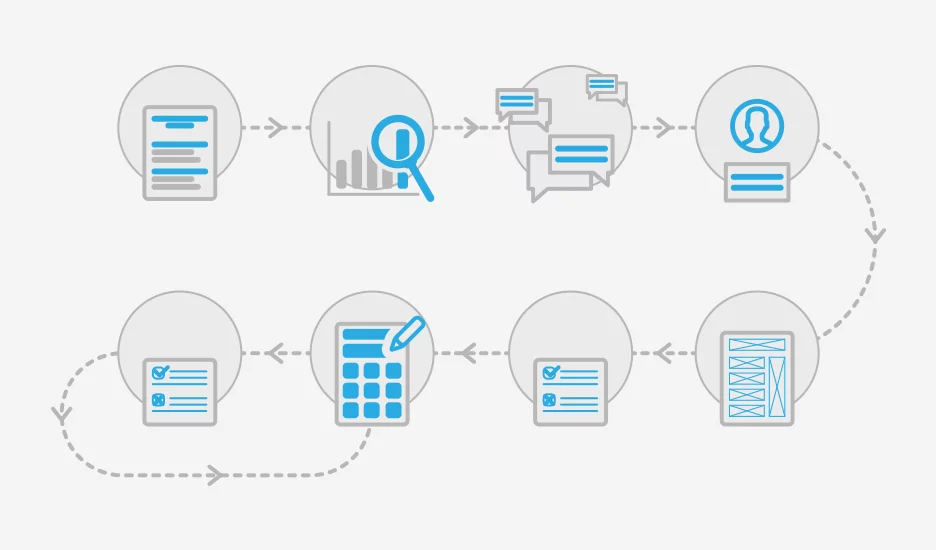
To summarize, the entire process can be clearly divided into the following stages:
- Brief and interview with the client
- Understanding users and analyzing data
- Interviews
- Creating personas
- Prototyping
- Testing
- Designing
- Testing
- Designing
- Testing
What should be the architecture of an informational website?
By interpreting user experiences, mistakes and shortcomings in designing the website itself can be avoided. Menu, homepage, and post page are some of the most important aspects of website architecture. They are the most frequently visited and provide users with the most information.
The menu area is almost always subject to revolution. Today, the focus is on simplification and logical organization while maintaining the most clickable labels. An additional functionality that makes life easier for the user is a sticky menu that appears when the action to return to the top is initiated. It's worth ensuring (if possible) that the menu ultimately takes the form of a single-level structure and includes other elements such as a newly designed logo, search bar, login panel, or language change option to English.
The purpose of the homepage is to fill it with as many posts interspersed with advertisements as possible (the website needs to make money) as well as other sections that engage readers. It's necessary to think about how to place ads so that they are not intrusive but still give the impression of an integral part of the website.
The slider, which we all know well, can be loved or hated. Recently, publications have been written about its usefulness. Only a custom-made and well-thought-out slider has a right to exist. By using A/B testing, we can determine which elements of the homepage should be the most important for us. You have to see something to determine whether a component will really fit in that place. The mere change of position, size, or color already provides measurable information about the fit of the element.
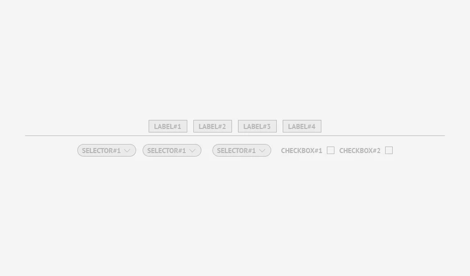
An important improvement that can revolutionize the website is filtering of added posts. With such a system at hand immediately upon entry, the user can change the listing to the category of interest in a very short time. This is one of many ways to provide information to the user in a friendly way.
By using avatars/teasers, we can provide the user with sufficient information about the time of publication, the editor, the department the article is from, and the number of comments. This makes it easier to understand how the news publishing system works. This way, we can convey information to users about their location in the website in the simplest possible way.
The post itself is also a collection of the most important elements, which are often important to the owner of such a website. Here, we have the idea of a full-screen page, especially if we have a little more space to use. In the main column, it is best to place the most important information along with text and other components such as a gallery/video material, suggested articles, and of course, the comment system. Side blocks are a place for potential ads but also elements that complement the content.
Working with a client
I have emphasized multiple times that client motivation is just as important as user experience. Therefore, working with the client should be conducted in such a way that they are constantly involved in the entire process with us. While working, we should provide the client with a project team that will be a real support to them throughout the process of creating a new graphic design. Sometimes it is worth moving to a more comfortable level and addressing the client as "you" to build trust, which the client should have in us to ensure smooth and obstacle-free work.
The work with the client can be divided into three stages. Before starting, a thorough analysis of the client's needs must be conducted to determine the problem we are dealing with, its scale, and what the client wants to achieve in the end product. What are their motivations and goals? At this stage, we can draw some initial conclusions.
During the work, as I already mentioned, the client should actively participate. Not only to give us a clear conscience as designers but also to know how their product will finally function. Why will this solution be better than the current one?
Nobody would want to finalize a project and have the client not approve the final result. Another value of involving the client in our work is their comments and observations as experts in their field. Intercepted at an appropriate level of work advancement, these comments can be implemented less invasively than at the very end and provide much more value for the project itself.
What happens if the client strongly insists on their idea, and their proposals, from our knowledge and experience, are not good for the project? I always try to present the strengths of the solution I propose and the benefits that come with it. I also do the same with the solution the client is opting for. What should you do? Inform the client about the benefits of their proposal and the consequences of implementing their idea or, if it is entirely impractical, diplomatically suggest not to go in that direction because the solution will not work.
Or simply meet or call the client and allow them to consult with you in a more direct way. If the situation allows for it, contract and conduct "face-to-face" consultations. Live conversation sometimes brings a completely different reception than it would seem in the email or on the Trello board.
With a bit of commitment from your side, the whole process will take place in a friendly atmosphere, generating valuable ideas that both you and the client will be satisfied with. Deadlines will not be frightening, and each side will always be well-informed at each stage of the work.
Summary
Thanks for sticking with me until the end. I hope you have gained some value from this text, or it has piqued your interest in some way based on the experiences gathered here.
I wanted to present the process of designing a complex informational website as an activity that does not have to be convoluted and complicated. With the power of design, analysis, and prototyping techniques at your disposal, you can effectively go through the entire process, not forgetting any of the aspects that build a given website. User awareness of UX is sometimes very low and needs to be changed if we want to build better and fulfilling websites.
Despite the complexity of the entire design process, it should be viewed as an organized set of stages that are maintained in a certain convention.
So it's time to answer the most important question: Can a redesign of a large information service be conducted efficiently? Yes, it can. Skillfully utilized tools and knowledge available to us nowadays should generate projects that will satisfy and meet the needs of the client.
You are certainly also wondering about one thing. Is it possible not to discourage all users from making a change? Impossible. You can't please everyone. The main factors are habits and personal preferences. That's why in the process of maintaining and developing an information service, attention should be paid to how the recipients perceive the product and strive to improve it.
When I started working at eEngine, I had three goals in mind. Realizing large and interesting projects that will be a design challenge. Personal development opportunities in areas that I'm genuinely interested in, such as UX and UI. A constant pursuit of maximum usability and promoting a "user-friendly" approach.
I hope that when designing your next information service, you will know what to pay attention to. As Maciek's motto says, "great rewards, great monsters."