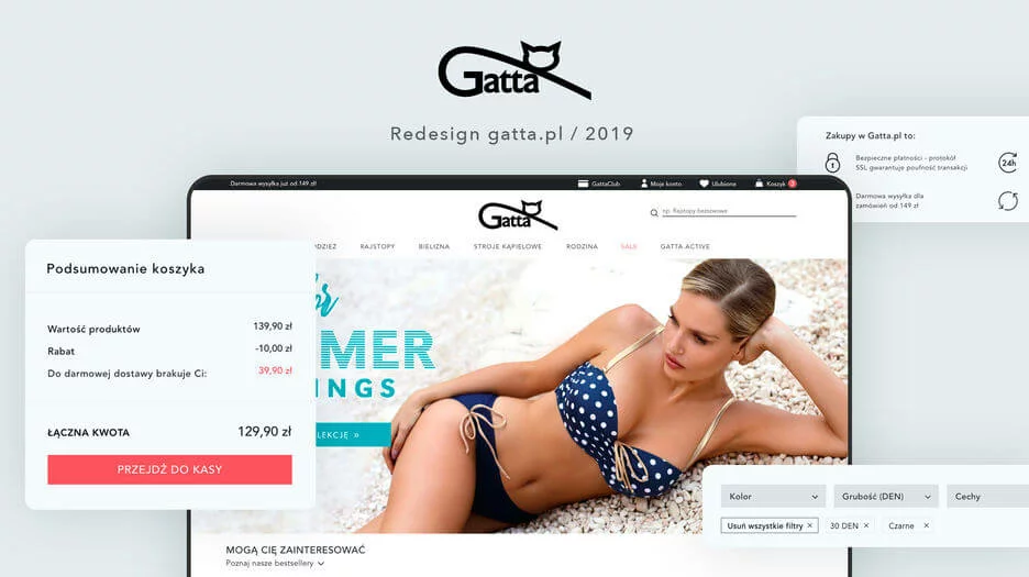
Redesign Gatta.pl 2019
The Gatta brand has been with us since 2014 when we first created Gatta.pl together. Since then, the store has changed its graphic design and user elements several times. Although it has been more of an evolution than a revolution, looking at the beginnings of Gatta's e-commerce and how the store looks today, it can be said that the changes are enormous.
Does Gatta need periodic redesigns?
New vs. old and what did it give us
The cyclical redesign on Gatta.pl usually lasts about a year. This period allows us to take a closer look at how recent changes have affected conversion rates, how users are adapting to new functionalities, and to explore what works and what we still need to work on.
For this version of the online store in 2019, both the client team and UI/UX and development teams on our side were involved. By analyzing traffic sources, user behaviors, and conducting in-depth interviews, we were able to identify the main problems with the previous layout and the points where users feel uncomfortable.
The biggest optimizations were related to clear information hierarchy and poorly recognizable benefits of shopping on Gatta.pl. The changes affected both the homepage, listing, product card, and typically procedural issues (cart, login, or account views).
Homepage - what did we improve?
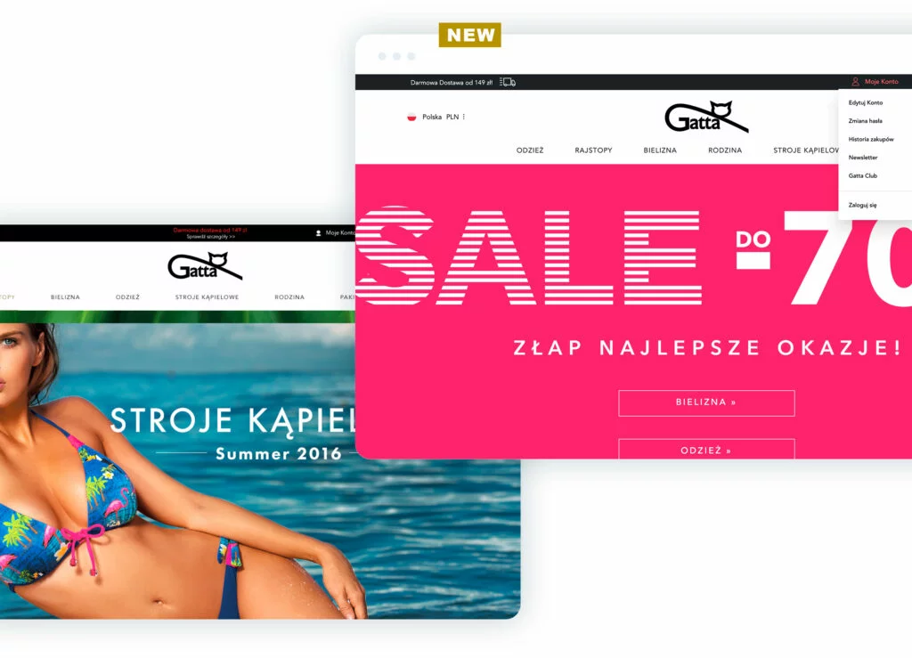
Users pointed out the little visible information about promotions in the top bar. Although it might seem that the placement (at the top of the page), color differentiation, or adding a CTA would be good practice, it was actually the opposite 🙂 The color caused the text to darken, the additional CTA link (white, so actually more visible than the promotion itself) introduced confusion, and placing it in the middle of the bar caused the text to merge with the logo below.
What did we improve? In theory - not much, in practice - everything. We gave up the additional "Check details" link. Now the entire text is a link (which is intuitive enough for users). Additionally, the text is always written in white, and when hovering the cursor over it, the color changes (strengthening the CTA). The placement on the left, where we have plenty of blank space below, translates into better text visibility.
Such examples, seemingly small changes, could be multiplied. All of them together contribute to a positive user experience and thus to a better perception of the store as a whole.
Other elements that we improved and the benefits they brought us are:
- The view of the expanded MY ACCOUNT - the user can now go to the desired tab in their account directly from the homepage (or any other page they are currently on), shortening their user path.
- The FAVORITES and expandable SHOPPING CART elements in the top bar clearly inform the user about the lack of added products, while also encouraging them to visit the NEW ARRIVALS or (especially important from a marketing perspective) collection;
- The MENU that follows the user allows them to quickly navigate to a selected subpage without having to scroll up to find it;
- The BLOG FEED builds brand awareness - Gatta is not just a store, but also an expert in its field;
- The CONTACT information (phone, email) is prominently displayed in the footer, appearing on every page, allowing the user to contact the store in a convenient way in case of any doubts;
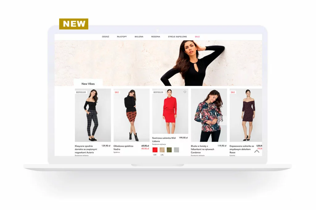
- On the HOME PAGE, in the new version of the store, we wanted to emphasize Gatta's products. Previously, the homepage primarily relied on graphic banners for new arrivals, promotions, or collections. Unfortunately, the large number of these banners, combined with various messages, caused the aforementioned information chaos. Currently, the products are dominant on the homepage. The graphic banners are thematically related to the products we offer to users. This approach helps us avoid information overload, present customers with a specific product offer, create inspiration, and connect products.
What about the product listing?
The PRODUCT LISTING has also undergone significant changes. We moved the SEO banner to the bottom of the page. From the user's point of view, especially for returning users, it was not significant enough to display it at the top. Hence the decision to move it. Thanks to this, after entering a category, we can much better highlight the products.
The presentation of the category tree has also undergone significant modifications. Previously, we only presented the main category with subcategories. Therefore, switching between main categories required an additional "activation" of the top menu. Now we display the entire category tree, so the user knows exactly where they are and has easy access to other categories.
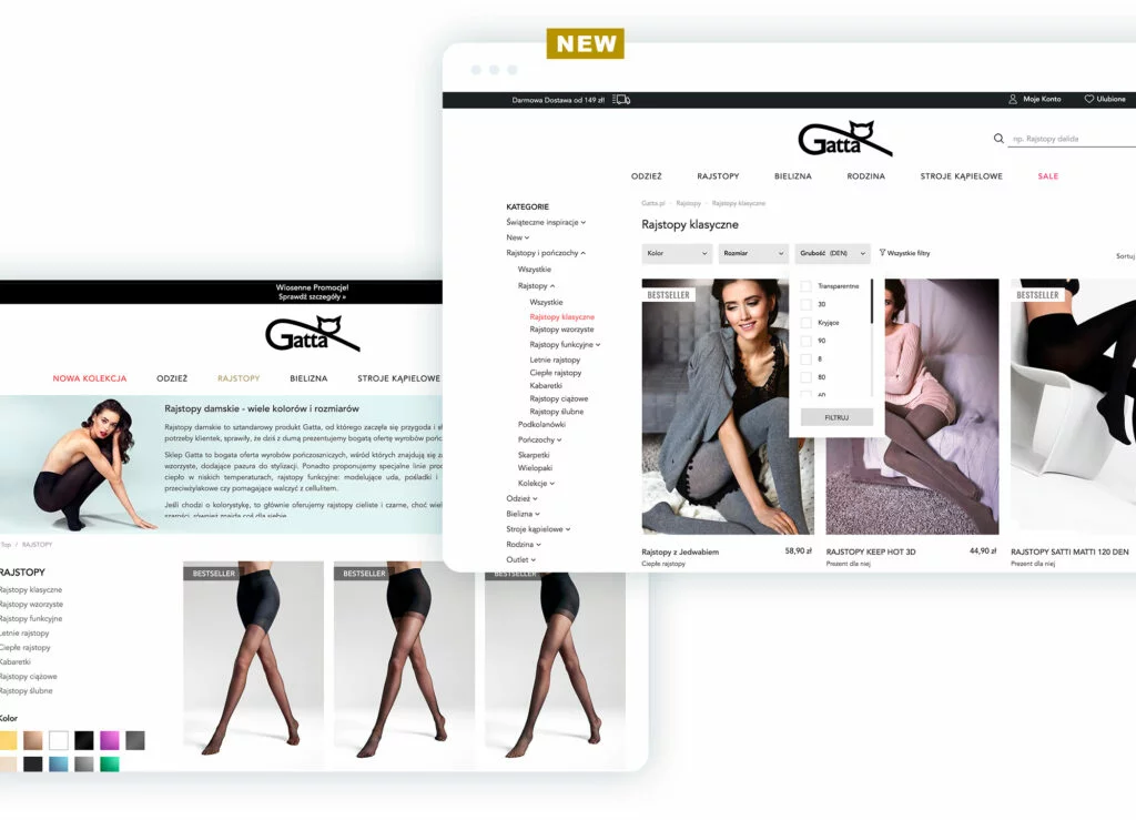
The flirt with filters has been going on for some time now 😉 Initially (like in most e-commerce stores in Poland), they were located on the left side, just below the category tree. For a period of time, as part of A/B testing, the filters were moved above the products. However, this concept did not work mainly because the filters were not very visible, blended with other layout elements, which at that time were less minimalist and more burdened with additional graphics. Currently, after moving the SEO text, leaving only the category title, and above all - increasing the category tree, moving filters above the products seemed necessary. Thanks to the graphic highlighting, the filters are well visible against the background of other page elements. Also, remember that user experiences change. More and more stores (especially in the fashion industry, such as Zalando, Reserved) decide on such placement of filters, getting users used to new solutions. Additionally, we have clear information about selected filters with the ability to remove a specific one or clear the entire filtering.
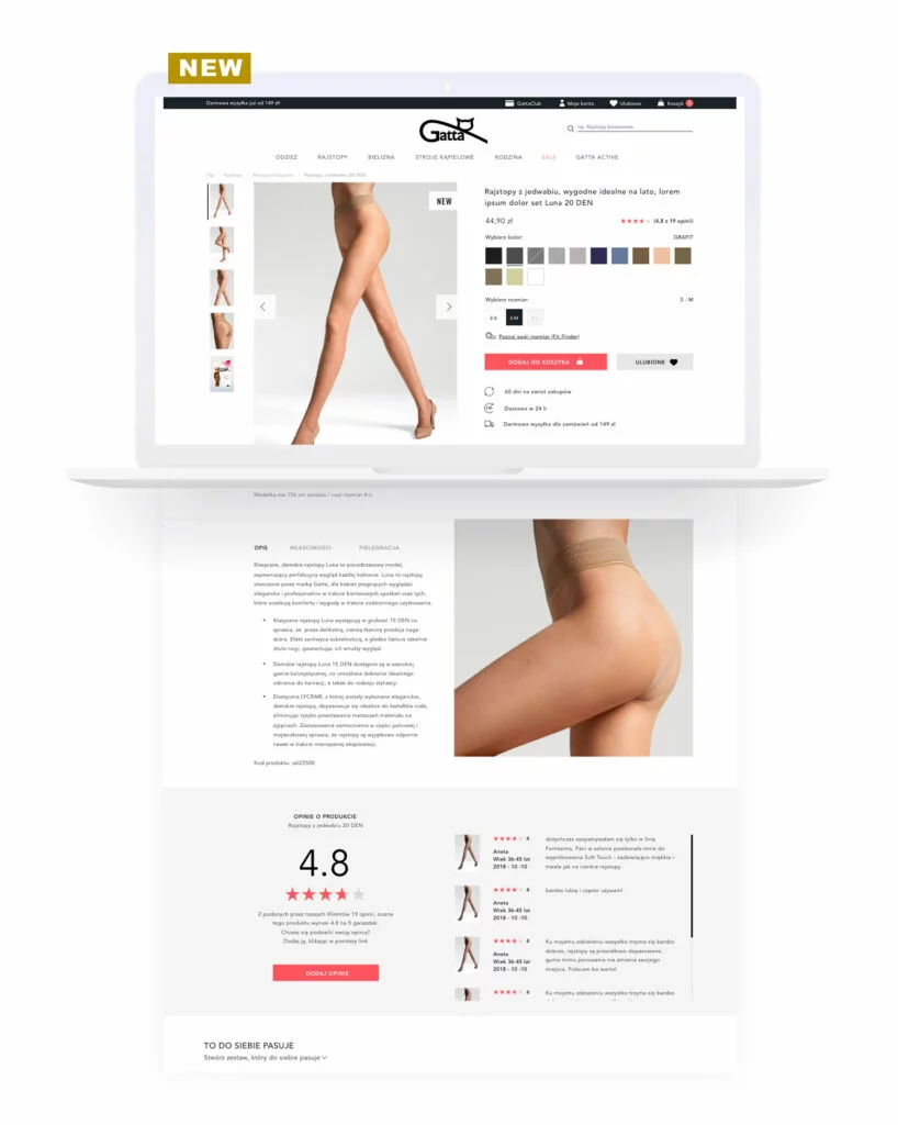
Product card
The product card should be functional and easy to use. Overloading it with too many elements (especially poorly composed ones) makes the page less readable. Our main goal was to optimize usability and highlight key information:
- we reduced the product name, making it easier to read (often the names are quite long), and the price is better visible;
- reducing the elements in the opinion module and moving them to the right side results in a better hierarchy and separation of information;
- higher placement of CTA (among others, thanks to the resignation of the category name) makes it visible on the vast majority of screens;
- highlighting the benefits of shopping (information about fast delivery or extended return procedures);
- we have given up on proposing products on the "others also bought" basis (which does not really appeal to users) in favor of complementary products or those with similar properties (alternative products).
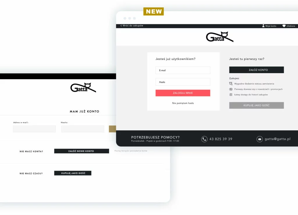
Login
Everything was there: the possibility to log in to the account (at the very top, to make it clearly visible) and the possibility to create a new account with its benefits (unfortunately, requiring an additional click). What was missing? Hierarchy, which was the main criticism of the old look of the page. We replaced the "one below the other" layout with the "side by side" layout, highlighting the login element, and the benefits of creating an account are immediately visible. We left the option of shopping without registration in the "I don't have an account" section where the user would most likely look for such an option.
Cart and checkout process
The new view of the cart includes both a clear presentation of added products and a summary of the cart. In the case of promotional products, the user has a clear indication of how much they saved by choosing a particular product (given in PLN). Additionally, regardless of the number of added products, the cart summary is always visible (floating box). In the summary, we highlighted the CTA and the total cost of the purchase.
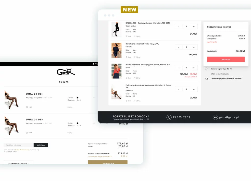
The checkout process mechanism has basically remained unchanged. We have moved the existing elements to the refreshed template, striving to optimize them even more in terms of usability. Hence, there is a clear division into subsequent steps: choosing the delivery method, payment, and order details. Great emphasis has been placed on validation. Both error messages and correct field completion are visible and unambiguous. A small but significant change is moving away from a uniform appearance of radio buttons and checkboxes in favor of distinguishing both functionalities.
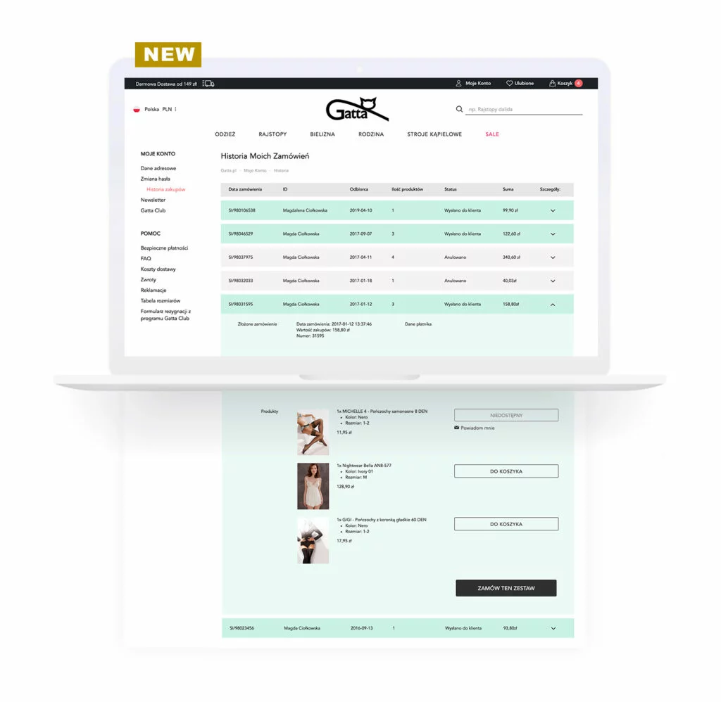
We also care about our regular customers, hence changes in "My Account"
We have also implemented several changes and functionalities in the area of a regular customer. In the "My Account" section, we have added help links, providing users with a permanent place where they can check a given issue or dispel doubts. At the same time, the most important help elements are available in the footer so that users without an account also have easy access to them. Based on the purchase history, by entering the order details, one can easily reorder both the entire cart and individual products.