Redesign Fripers.pl - the vision of a modern online store for photography enthusiasts.

A shop for photography enthusiasts - what could it look like? Today we present a proposal for a brand that supports both professionals and amateurs. We tried to approach the redesign of Fripers.pl by using the elements that are characteristic of the brand and presenting them in the most attractive way possible. See for yourself.
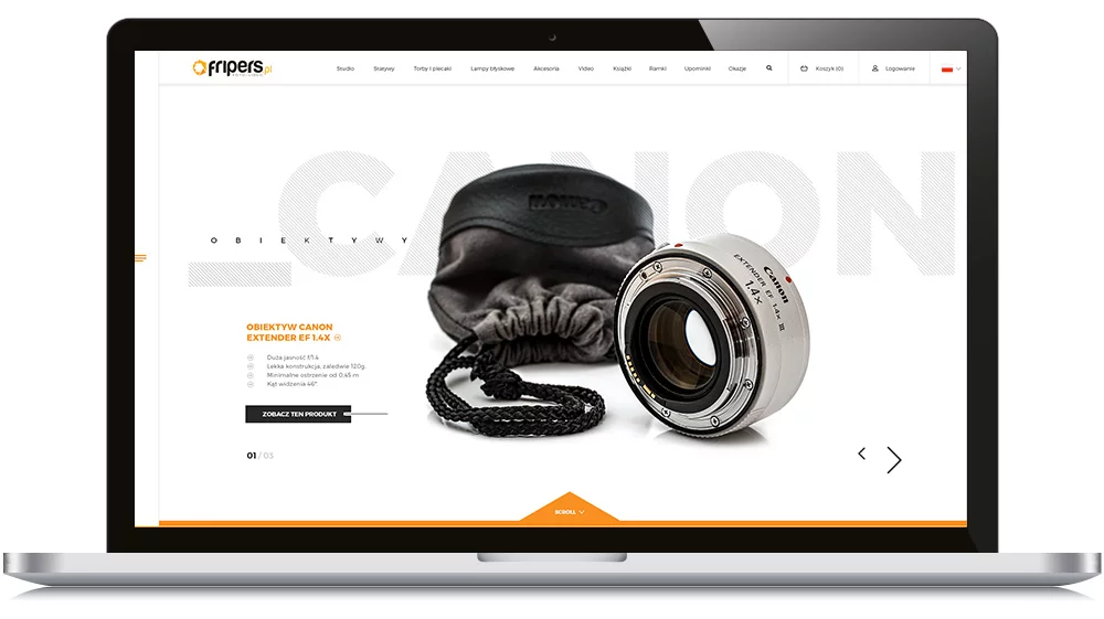
Homepage of the store
Due to the technical nature of the Fripers.pl store, the products presented, and in reference to the colors of the logo, the store is kept in bright colors that are reminiscent of the brand. Important elements are accentuated with orange and dark gray. The font used works well in both larger "bolded" headers and descriptive text.
Significant changes have been made to the presentation of the menu and main information, which are now visible in the top section of the page. Due to the large number of elements (menu, search, language, cart, basic company information, hotline, login), we divided them into two sections. The top menu consists of sales functions. We therefore isolated the following: menu, search, cart, login, and language. Informational elements (about the company, contact, hotline, social media) are visible after clicking on the floating bar on the left. This way, they are always "within reach" (especially important contact information, which can be helpful in such a specialized product industry).
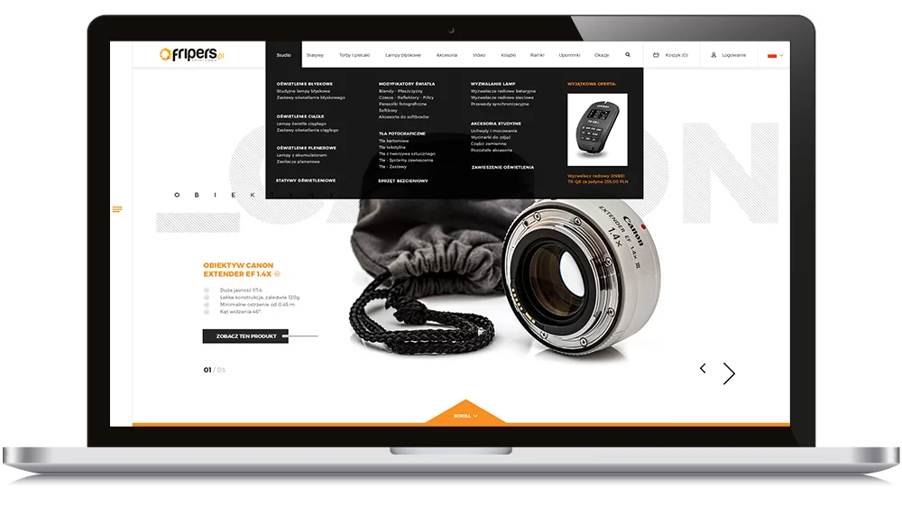
- megamenu - we don't hide subcategories, they are immediately visible. This approach allows for faster navigation to the desired category while maximizing the use of space.
- side menu - the aforementioned informative elements, in the form of large links, as well as the always-visible hotline and social media icons, enable quick and easy access to assistance.
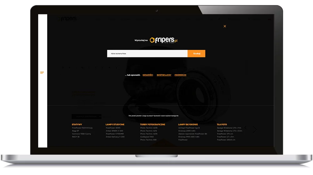
- the suggested search bar, covering the entire site, not only helps to find products but also "suggests" the most frequently visited categories. Thanks to this feature, even someone who was not entirely sure what they were looking for (e.g., a tripod, but which one?) is immediately offered specific products.
- login - it leads to a separate subpage, where users can log in or create an account. When the user is logged in, the "Login" label is replaced with "My Account," which features a dropdown menu to account settings, order history, wishlist, and a logout option.
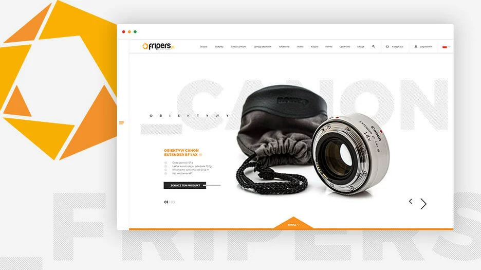
The "Slider" primarily serves a presentation and sales function (assuming frequent rotation of products - they should be changed at least once a week to avoid user fatigue). It is a good place to feature promotions or special offers, thanks to the use of the entire width of the page. With the product name, several key pieces of information, and a CTA button located just below the description section, we have a clear message about where the slider leads us. Additionally, we display the number of graphics in rotation. The graphic assumes the area visible "above the fold", meaning above the scrolling line. Hence, the strongly marked scroll element with a downward arrow. There is no doubt that, despite the "closed" graphic presenting the product in a certain space, there is more of the page below.
The next sections of the homepage present the most popular brands, which link to specific product categories (or all products for a given brand). This section aims to highlight the middle brand and focus attention on its categories (by reducing the opacity of the others). The next sections are scrolled left/right.
Below is a section with banners linking to the newest products, the top category, or less obvious "gift ideas," which are not emphasized on the current site.
The product section also utilizes the newly available space. This approach allows us to introduce higher quality, larger photos, clearer product names, and prices. The product presentation should attract attention, so hovering over the photo should automatically display a different image showcasing the product detail or a different angle.
The product section also uses the newly available area in its space. This allows us to introduce higher quality, larger product images, clearer product names, and prices. The presentation of products should attract attention, so on hover, the image should automatically switch to another one showing either the product detail or a different angle.
You can admire the refreshed version of the store's homepage here.
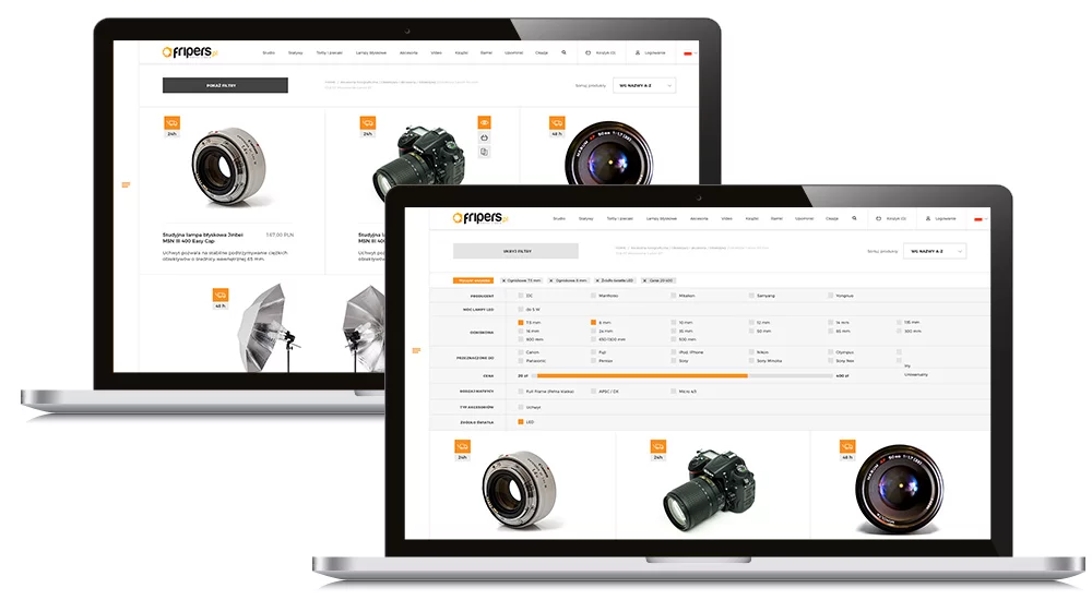
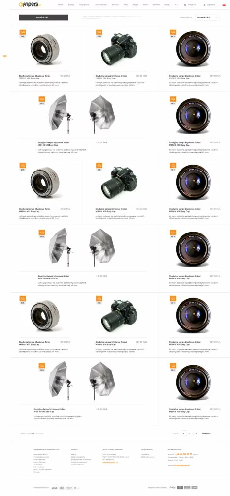
Product listing
The product listing page is strongly focused on the visual presentation of products. The information currently found on the listing has been organized around the product. Both the name and price do not change position relative to the homepage. They are "enriched" with an additional short, one-sentence description located below the product name. Thanks to this, we have a logical whole: name, price, description. Availability and delivery speed are presented with icons and time, making it easy to see the information and quickly assess the shipping time. The product links to both the photo and the product name. Additionally, on hover, action tiles slide out, allowing you to see the product description, immediately add it to the cart (useful, especially for smaller accessories when we're not interested in the description), and the ability to add it to the comparator.
The filters are initially hidden, allowing us more space to present the product. Clicking on "show filters" expands the module presenting all available filters for a given category from top to bottom across the page. With this presentation of filters, even with a small number of them, we don't lose space on the page on a "white background" below the filters.
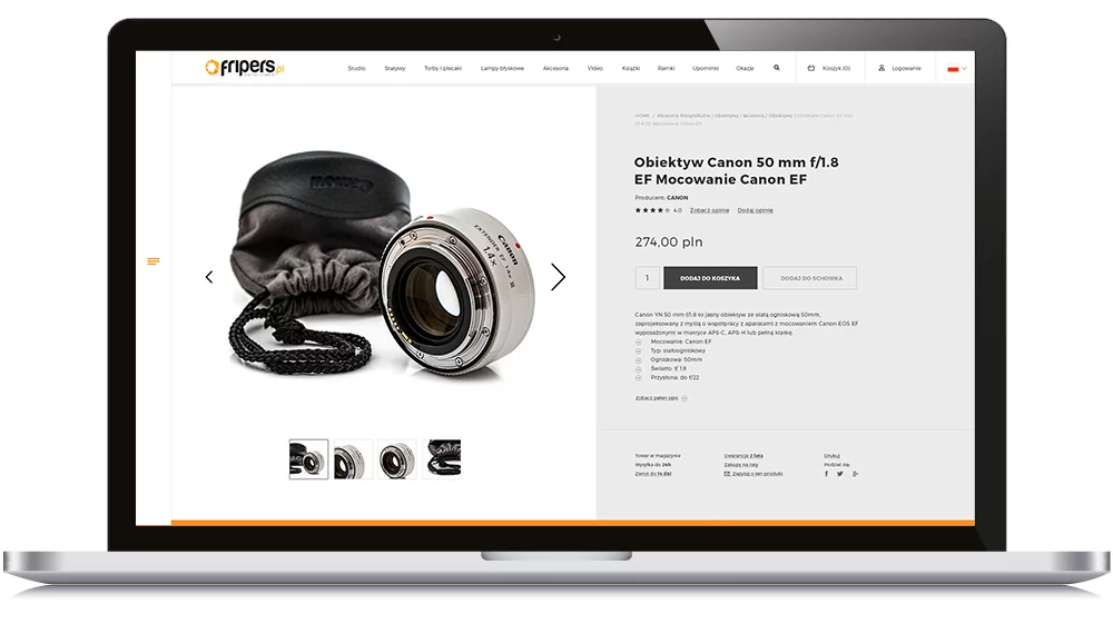
Product page
The product page has been divided into two sections. On the left side, we have a well-exposed product along with a gallery of thumbnails. On the right, we have all the basic information, which is arranged in a certain hierarchy when read from top to bottom. The main goal was to minimize the effect of an invisible CTA button. Therefore, the arrangement of the elements: product name, manufacturer, reviews, price, and buttons. Only below do we have a section with a description and organized elements with additional information
Below, we have a section with basic information, reviews, questions presented as switchable tabs, and the "others also bought" element.
The view of the product card is closed by a reminder of the benefits of using the store (as a element that strengthens the sense of security), a newsletter signup, and the footer as usual.
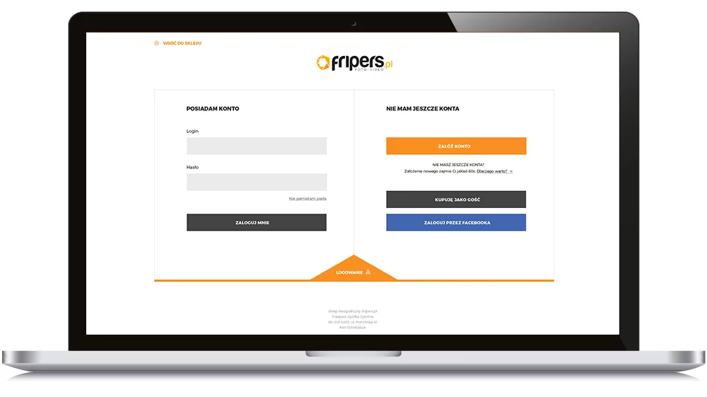
Login
The login page is very minimalistic, with only the most important elements. It is tailored to both people who already have an account and new users, hence the clear division into two sections. This page is also visible as the first step of the purchase process. After clicking "order" in the shopping cart, the user is automatically directed to this subpage. For existing users, it serves as a kind of "reminder" to log into their account (which provides benefits such as order history), while for new users, it encourages them to create an account, for example by highlighting the advantages of having an account at Fripers.pl. However, there is a group of people who will want to use the store occasionally - for them, the "Buy as guest" button is provided.