Brandbook EENGINE
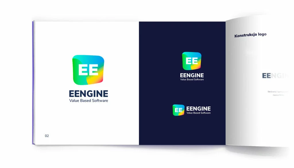
The transition between 2018 and 2019 was very exciting in terms of visual changes within our company. It was then that the idea of creating an "infinite logo" - one that evolves with changes in the company - emerged in our minds. You can find the whole story of how we essentially "don't have" a logo here. Looking back from the perspective of 2020, does this concept still hold up? Yes! The logo that identifies the whole team and evolves with it still inspires enthusiasm in our hearts.
Not just a logo, a few words about chaos
Brandbook EE 2020, or how we organized the chaos
Creating a more comprehensive brand book that refers to various areas in which we use our corporate ID turned out to be the answer to these problems.
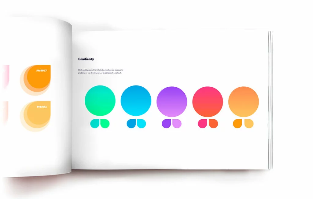
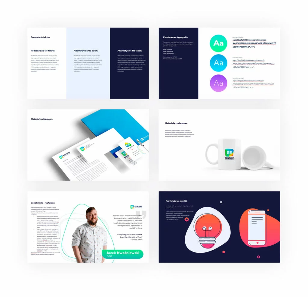
First of all, we set boundaries (both in terms of font selection and colors and the resulting gradients or visual elements). We have specific guidelines for constructing social media posts (dimensions, colors, content layout), company presentations, or printed materials.
We created a model of icons and graphics and provided instructions on how to use them depending on the situation. Do we have an answer to every eventuality? Of course not. But creating fairly extensive guidelines for these basic issues makes it easier for subsequent things to "practically do themselves" 😉
We opted for minimalism "in the extras" and greater consistency in all elements created for EE. We try to make elements related to the company ID highlight content rather than "cover it up".
For me as a graphic designer who is largely responsible for the visual presentation of the company, the situation in which I know what I can use and what the rules are not only speeds up the work but also brings greater satisfaction with its effects. It is also much easier to work together on subsequent projects. Thanks to the guidelines, regardless of the person designing, the final result is identical to the EE ID. And that's what we aimed for!
Is this the end?
The brand book is currently an invaluable tool for creating our corporate projects. However, it is not a complete or finished tool. And that's also great!
Approaching a new project (whether it's a company website redesign, a blog post, or a Facebook post), we first open the brand book and see how it can help us. Most cases are already described and designed, so without worrying about inconsistency of identification, we use these elements. But what if we don't have something "covered"? Then we design based on what we already have developed, check how it fits with other ID elements, and if we see that it works, it goes into our brand book. Thanks to this approach, the tool we use so often is always up to date.